Archiv der Kategorie: Design&Fashion

Alles was gut aussieht. Bis auf Mädels.

Fashion Design Jerseys

Ich fand schon immer die Jerseys der Pro-Teams hässlich. Da wurden zwangsweise Farben und Formen von zwei willkürlichen Sponsoren gemixt und dann noch jede Menge kleiner, unpassender Logos von Nebensponsoren drauf gepappt wo gerade noch Platz ist.

Es geht aber auch anderes. Vorgemacht hat es letztens Jahr EF Cyclyng bei der Giro d’italia. in Koperation mit Rapha und Palace. Hm, Rapha, auch eine Marke die ich eher selten lobend erwähne. Aber man muss ihn zu Gute halten, dass sie Schlichtheit und gedeckte Farben zurück in den Radsport gebracht haben.
Im Oktober letzten Jahres gab es einige interessante Berichte über Stijn Dossche, einen belgischen Designer der sich ausgedacht hat, wie Pro-Team Jerseys aussehen könnten, wenn sie von Fashion Brands gestylt würden. Das kann man sich schwer vorstellen? Nein, eigentlich nicht, hier einmal zwei besonders gelungene Entwürfe:#

Trek x Supreme … seit Wochen denke ich darüber nach mir diese Jerseys selber anfertigen zu lassen

Louis Vuitton: Jeder der einmal in Japan war wird die unglaubliche Signifikanz dieses Jersey einleuchten.

Aus seinem Instagram Account kann man noch viele andere sehr schöne und lustige Ideen bewundern.

Ein Kommentar

Eingeordnet unter 2021, Design&Fashion, Mob

Rad. Armee. Fraktion.

Hannes machte mich letztens auf dieses unglaublich gestylte und recht günstige Jersey von Craft aufmerksam, dass wir uns dann gleich kaufen. Mussten.

1901 Craft RAF

Das gibt es oder gab es hier. Manchmal kommt man ja erst ziemlich spät auf Dinge, die so offensichtlich sind. Wie zum Beispiel, dass im Wort „heiraten“ , das Wort „raten“ enthalten ist – ein nicht ganz unwichtiger Hinweis für die Wahrscheinlichkeit den oder die richtige zu binden. Das Craft Jersey ist so gestaltet, dass der erste und letzte Buchstabe von vorne nur noch ansatzweise zu erkennen sind, so dass lediglich RAF in schwarz-rot übrig bleibt, dazu in einem geradezu klassischen Siebziger Fahndungs Aktenzeichen XY Design.

Screenshot 2019-01-02 18.00.48

Bildergebnis für rote armee fraktion steckbrief

Anarchistische-Gewalttaeter-Baader-Meinhof-Bande-034-Fahndungsplakat-RAF-gelb

Ein echtes Muss, wenn man links-liberal in den Siebzigern und Achtzigern aufgewachsen ist. Ich muss gestehen, in meiner Jugend hatte ich eine Menge Sympathie für die RAF, vor allem deswegen weil meine Eltern, Lehrer und andere Autoritätspersonen die so doof fanden. In meinem Jugendzimmer hing sogar eines dieser Fahndungsplakate, ich hatte das Bild von Christian Klar ausgeschnitten und mein eigenes eingesetzt. Ja, so fühlten wir uns damals, wir Verfolgten des Systems BRD; also will sagen des wirthschaftlich-militärischen Komplexes, oder wie auch immer.

Heute, selber Autoritätsperson, Vater und Lehrer geworden, sehe ich das natürlich anders; gerade wenn ich ab und an die alten RAF Säcke in Interviews sehe und merke, was für unsympathische (und nun auch alte) Menschen das sind.

Trotzdem finde ich, dass uns die RAF einige sehr schöne Momente des Designs geschenkt hat. Danke an Craft für die Wiederbelebung.

4 Kommentare

Eingeordnet unter 2018, Design&Fashion, Mob, Sex. Lies & Vids

Colors of 2019: Teil 1: Cannondale

Als neuer und naiver Radhändler habe ich das große Glück im Sommer zu den privaten Messen der Hersteller fahren zu können, um mir die Räder für die nächste Saison anzusehen. Weil die Ausstellungen deutlich kleiner sind und oft auch Probefahrten möglich gemacht werden, macht das deutlich mehr Spaß als sich 2 Millionen schwarzer Räder in abstrusen Formen auf der Eurobike in Friedrichshafen anzusehen.

Dieses Jahr war ich bei Cannondale, Trek, Giant und Wilier, die wir nun seit ewigen Zeiten (also seitdem wir den Laden im März 1818, Verzeihung 2018 aufgemacht haben) in Bremen vertreiben. Dazu habe ich mir bei Trek auch die Diamant Räder angeschaut und zum Schluss noch einen Abstecher zu Derby Cycle (Focus, Cervelo, Santa Cruz, Gazelle) eingeschoben. Dieses Jahr interessierte mich weniger, was Räder so können, denn das hatte ich im letzten Jahr bereits schon ganz gut mitbekommen und so viele Innovationen hat es in der Zwischenzeit auch nicht gegeben. Nein, mich interessierte eher, was es so neues an Formen und Farben gibt.

Den Anfang macht Cannondale.

Cannondale stellte in Heidelberg aus, da war ich nicht mehr, seit ich 1984 als Punkrocker aus sofort verständlichen Gründen dieses Straßenschild abmontierte und bei mir zuhause an die Wand pappte. Seitdem hatte sich einiges getan offensichtlich, so war quasi die Landschaft hinter dem Hauptbahnhof in einem riesigen Loch verschwunden . Am Rande dieses Lochs hatte Cannondale seine Halle. Die meiste Zeit dort verbrachte ich mit dem Probefahren des System Six (das ist das neue Aerorad von Cannondale, also das Gegenstück zum Madone von Trek, dem Propel von Giant oder dem Cento1Air von Wilier). Das System Six ist, ehrlich gesagt, nicht mein Rad, aber das ist nicht weiter wichtig.

Cannondale hat ein grundsätzliches Designproblem bei seinen Rädern, und das ist, dass der Name Cannondale im Gegensatz zu Trek, Wilier, Giant, Cube, Focus, Basso oder Look sehr sehr lang ist und erst einmal auf einem Unterrohr untergebracht werden will.  Ungünstiger ist eigentlich nur Tommasini oder Schindelhauer. Und deshalb heißt ja auch Verbund Service und Fahrrad VSF und macht langweilige schwarze Räder mit roten Klingeln damit das nicht so auffällt.

Cannondale habe ich farblich seit jeher als sehr auffällig empfunden, immer sehr hart am aktuellen Neontrend kratzend – denke ich an Cannondale in der Nacht, dann träume ich von neongrünen Landschaften mit gelben Schriftzügen. Das war dieses Jahr nicht anders, aber es gab auch einige sehr schöne Ausnahmen von der Regel.

can 1

Dieses Jahr war es bei den Herstellern sehr trendy, viele Räder mit Seilen von der Decke vor einer Wand abzuhängen. Bei Cannondale war z.B. dieses MTB für Mädels in Acid Strawberry zu sehen – kommt hier leider nicht so gut rüber wie in echt.

can 2

Das CAADX Alu Cyclocross Bike in der Ultegra Variante im mutigen Purpur.

can 3can 4

Auf der Ausstellung gab es auch ein CAAD12 zu sehen, das ich sehr interessant fand. Das CAAD12 ist ja schon sehr leicht, teilweise leichter als so mancher Carbonrahmen im Laden, aber da Alu ja eher etwas für Einsteiger ist, wird er nur mit Shimano 105 oder Ultegra angeboten. Das ist bei der Konkurrenz – soweit ich den Überblick habe – nicht anders. Jetzt gibt es zusätzlich eine Dura Ace Variante mit Powermeter -sozusagen die Edelalu Variante.

Die hatte auch ein sehr schönes Muster am Oberrohr, gar nicht langweilig.

Fazit

Cannondale war dunkel oder neon, mit ein paar schönen Farbtupfern.

Ein Kommentar

Eingeordnet unter 2018, Bike Buisness, Design&Fashion, Mob

Anthony Bourdain

2bbf703a-658e-4d22-adef-72c8a0ab49ed_800

I bought his book „Kitchen Confidential“ in September 2002  either at an airport or at a bookshop in Tokyo. I liked the coverphoto, a weird mix of styles – Hippies from the Seventies to Butchers from Fin de Siecle.

I read the book, I liked it. Although in the end it reads rather thin. I liked to guy. Later I found out that what Anthony Bourdain has become really famous for was reporting for CNN about travelling and cooking the world. Like Charlet Duboc doing similar things about fashion for Vice TV. Although enjoying good food and dressing smartly, looking at food or fashon respectively on my computer screen does not rank high on my priority list.

1491585185809obama-anthony-bourdain-ht-ml-180608_hpMain_12x5_992

So sad to hear that he dies.
Similiar sentiments at Red Kite Prayer.

Hinterlasse einen Kommentar

Eingeordnet unter 2018, Design&Fashion, Mob

Milano Fixed.

… ist nun wirklich das Blog mit der wildesten, kreativsten und ungewöhnlichten Auswahl von Fotos, Videos und GIFs. Kleine Auswahl von letztens.

via Milano Fixed

010203

4 Kommentare

Eingeordnet unter 2017, Design&Fashion, Mob, Sex. Lies & Vids

Cycling photos of the year 2016.

The Grubers’ Shortlist!

by Cycling Tips

The Pro Men are coming. 
Chico Stage Race, 201617-0-mark-gunter-sunriseTour de France 2016, Stage 12: Montpellier to Mont Ventoux98-0-jaygolian-0004103-2-lz7a4607_20161015_marshallkappel_www-kappel-cc129-1-386a0831_edit_2048-1140-1-fullsizerender3140-2-fullsizerender4-1165-2-img_1681Brazo de Hierro © 2016Processed with VSCO with f2 preset209-0-goteborgscross-swecup-2013-photo-by-valentin-baat-2013_10_12-8564DCIM100GOPROGOPR0644.JPG232-1-la36792-copy-1250-0-dsc09540251-2-brady_lawrence-3-1264-0-wintertraining_2016Tour of Qatar - Stage FourTeam Sky Training Camp283-2-1tou2016s7-hail-storm-d-parks-1300-0-monsterdavor-8-1309-0-wouter_roosenboom00003-2326-2-mgp_03Beauty & Danger of Racing382-0-20161120_191840-01407-0-sf141-12016 Tour de France Cycling Tour Stage 4 Saumur to Limoges Jul 5th422-2-dsc_0197455-0-image2DCIM106GOPROG3360050. Processed with VSCO with hb2 preset


5 Kommentare

Eingeordnet unter 2017, Design&Fashion, Mob

Martini. Deluxe.

Das Design und die Farben älterer Rennwagen, wie z.B. der von Gulf gesponsorten Porsche Langstreckenrennwagen oder Martini Rallye Wagen gefällt mir ausgesprochen gut.

Das nächste Carbonarbeitspferd im Stall wird, wenn alles gut läuft ein Gulf-Design bekommen. Die Idee ist weder von mir, noch neu, einige Hersteller haben bereits ähnliche Designs auf den Markt gebracht, wie z.B. State Bicycles Undefeated Le Mans.

Hier noch eine sehr schöne Martini Variante von Deluxe mit einem Video im entsprechenden Zeitgeist.

Leider ist auf der Deluxe Website nichts davon zu finden.

Das hat jetzt gar nichts mit dem Thema Design, aber sehr viel mit Zeitgeist zu tun: Letztens machte mich Andi auf eine ZDF Aspekte Sendung aus den Siebziger Jahren aufmerksam, in dem die Geburt des Punks in England wohlwollend zur Kenntnis genommen wird.  Der Bericht ist mittelprächtig interessant, zeigt er doch ein bislang nicht gesehenes Interview mit den Sex Pistos, mit Siouxsie vor den Banshees und Wilko Johnson von Dr. Feelgood. Großartig ist hingegen die Anmoderation durch jemanden der aussieht wie meine Französischlehrerin Frau Otten. Wenn man das sieht und dazu diesen freundlos heruntergeleierten Mix aus Kunstkulturgehabe und korrekter sozialdemokratischer Interpretation hört …. ich frage mich, wie ich diese freundlose Zeit überhaupt überleben konnte. Nie wieder werde ich schlechte Worte über RTL2 etc. schreiben.

Aspekte Punk in the UK

praesentation1


Hinterlasse einen Kommentar

Eingeordnet unter Design&Fashion, Mob

Regeln.

Retrogrouch Rules: Proper Bike Setup

Want to start an argument with fellow bike worshipers? Try to establish some „rules“ for proper bike setup. Of course, bike set up can be a very personal thing, and ultimately, the only „rule“ that really matters is if something works for a person and lets them ride their bike comfortably. But some bike setups just seem to look „right“ and probably work pretty well for the majority of people – and if something deviates too muchfrom the „ideal,“ it can look pretty odd, and it’s often a sign that the bike doesn’t fit properly, or perhaps the bike’s owner doesn’t know any better. I mean, if someone’s bike has a saddle tilted at some extreme angle, it’s possible the owner has arrived at the unusual position after many miles of trial-and-error and has found that it’s the only position that lets them ride happily for miles upon miles. But more likely, the person is a noob who has no idea why his various body parts are going numb after a ride of only a couple of miles.

The subject of the „right“ setup will probably never garner universal agreement, but it can generate some interesting discussion. One well-known polemic on the subject can be found on the Velominati site (see The Rules) and the subject was recently discussed at length on the Classic Rendezvous Google group. It can be fun to hear different people’s opinions on the „proper“ setup — and so here are my Retrogrouch Rules on Proper Bike Setup.

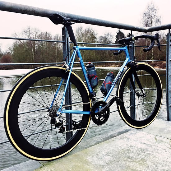
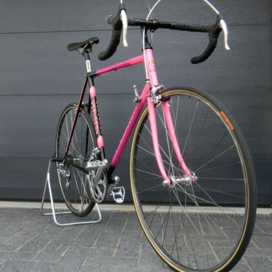
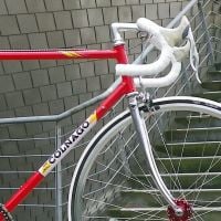
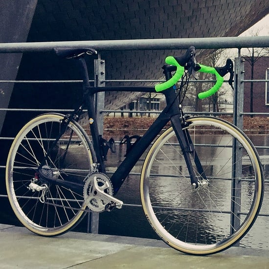
Collector Kevin Kruger has a lovely old 1960s Galmozzi that I featured here on the blog last year. Looking at photos of the rest of Kevin’s collection on Flickr, I couldn’t help but be struck by the fact that most of his bikes (and he has quite a collection) are superb examples of how a classic road bike should be set up. Take this Colnago for instance:

For a classic steel race bike, it would be hard to find fault with this.

Saddle:

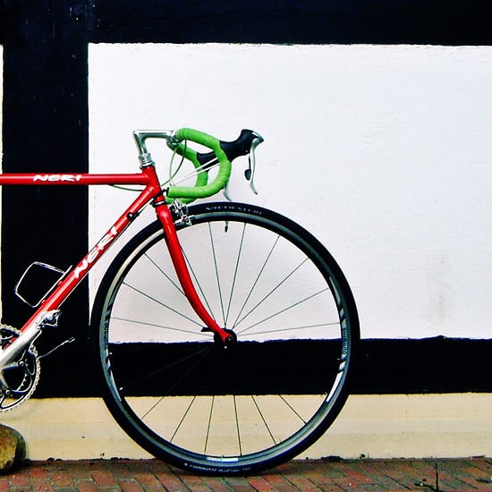
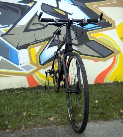
There ought to be a law against
this.

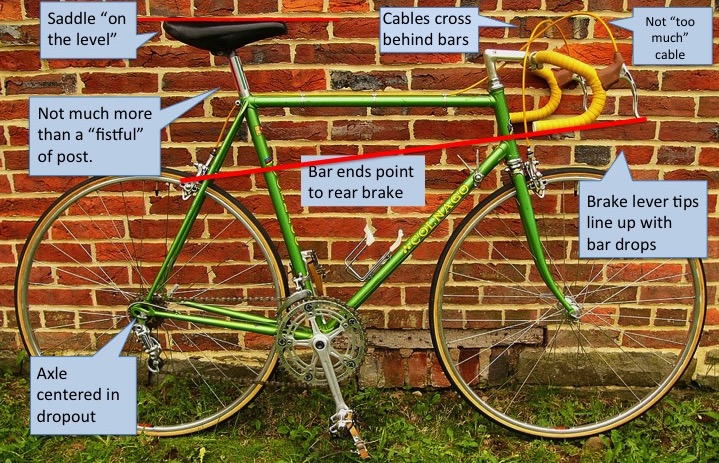
Should be level – or at least close to it. Some people may need a small amount of tilt forward, or back, but more than a couple of degrees of tilt either way is often a sign of inexperience, or poor bike fit. For most riders, nose too high leads to numbness in the genitalia. Nose too low leads to sore hands, neck, and shoulders. I see a lot of street „fixies“ that have saddles tilted drastically nose down. I don’t know if that’s got something to do with a riding style that relies on performing mad skids, or unusual brakeless dismounts, but either way, it’s apparent that the bikes aren’t actually ridden in any practical sense.

For saddle height, the old rule in the classic era was a „fistful of post“ (maybe 4 – 5″) though on road racing bikes from at least about the ’70s and later, because of evolutionary changes in geometry, expect to see a little more than a fistful. Larger frames will often have (and/or need) a little more seat post showing than on smaller frames. But on a classic steel road bike, having a whole lot of seatpost showing (like 7″ or more) is a sign that the frame is probably too small for the rider.

Bars:

There are a number of variations on the classic drop bar – some with deeper or shallower drops, some with ramps that are roughly parallel to the drops, and some that have ramps that dive steeply to the brake levers. It seems to me that most of them look best when the drops point down slightly from level, with the bar ends pointing in the vicinity of the rear brake. This has a practical reason, because when riding down in the drops, having a bit of a downward angle makes for a more natural hand/wrist position for most riders.

On a classic road racing bike, like the Colnago shown above, the tops of the bars might be somewhere between 1 – 3 inches below the top of the saddle. On a more touring-oriented bike, the difference in height would likely be less. More than 3 inches in difference is another indication that the frame might be too small for the rider. Yes, some people like to „slam“ the stem all the way down to the headset, but on a classic steel bike, I think that looks affected.

Brake Levers and Cables:

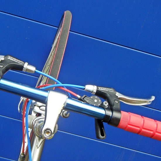
Line up the lower tips of the brake levers with the bottom of the handlebar drops. The way I do that is with a straight edge (a piece of aluminum flat bar stock works well) and a rubber band. I affix the straight edge to the handlebar end using the rubber band. It then projects forward at the same angle as the drops, and I can then adjust brake lever position so they just touch the straight edge.

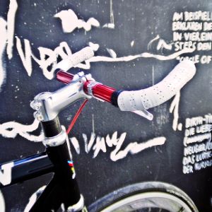
Not „too much“ cable! If the cables exit from the top of the brake levers, as opposed to aero routing under the bar tape, then there should not be huge loops of cable springing up over the bars. Enough for a smooth arch, and enough that the cables don’t bind when the bars are turned or the brakes are applied. Also, it just looks „right“ if the arches of cable on the left and right are balanced. It can help to start with the front cable — get a smooth arch from the lever to the brake caliper, passing up and over the bar. Then get the rear cable to match the size/height of the arch up front – cross the cables behind the bars – then work on the arch at the rear of the bike too. Again, smooth, not too much cable. It should exit the rear cable guide gently in a continuous arc. Too long, and there will be double curves. Too short, and it will pull or bind when the rear brake is applied.

If it worked for Eddy. . . 

A lot of riders from the baby boom era or earlier like to say „if it worked for Eddy . . .“ So here are Eddy’s brake cables:

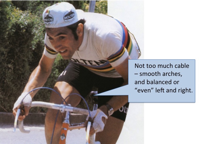
Smooth, even arches. No huge loops of excess cable.

Wheels, Quick Releases, and Tires:

On a classic steel road bike, black sidewalls are practically a crime against nature. It’s possibly acceptable on a bloated carpet fiber frame with carpet fiber rims – but looks bad on a classic vintage road machine. When using clincher tires, the tire labels should be lined up with the valve stem. That’s not just an aesthetic affectation — it can help when it comes time to locate and fix a punctured tire. On sew-ups, the label placement is up to the mercy of the manufacturer, but to the best of my knowledge, many of them line up that way (though not all of them). Labels should be visible/readable from the drive side of the bike.

On a bike with horizontal dropouts in back, I’ve seen different recommendations for wheel placement. Some reputable and well-respected enthusiasts insist that on a racing bike, the wheel should be as far forward in the slot as possible, giving the shortest possible wheelbase. I’m more of the opinion that it should be centered in the dropout, so that the line of the seatstay intersects the center of the wheel axle. To my eye that just looks best.

Quick release location is practically a religious issue, but I have my preferences. Functionally, I think it best when the lever is closed so that it is roughly parallel to the fork blade in front, or the seatstay in the rear. It is easier to close the lever when you can wrap a hand around the lever and the frame member, and easier to open it again if it doesn’t cross over the frame member. Visually, it looks good when both of the levers point to the rear of the bike, so I find that acceptable.

Again, refer to Eddy. . .

Eddy’s front QR lever points back to the rear wheel. His rear QR points up at his saddle, roughly parallel to the seatstay. However, he wasn’t always consistent with that. I’ve seen photos of Eddy racing where both levers pointed to the rear of the bike, and a couple where the front lever pointed upward, roughly parallel to the fork blade.

What is unacceptable to my eye is a front quick release lever pointing forward. It just seems unnatural. Oh – and quick release levers should be on the left side of the bike unless you’re running Campagnolo Cambio Corsa gear changers.

Disclaimers:

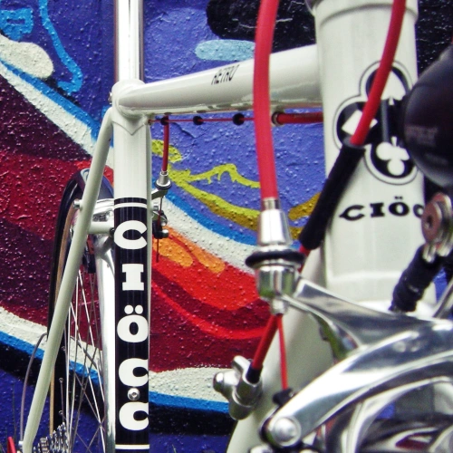
Taking a close look at my ’73 Mercian, I’m thinking I might need
to trim a little off those brake cables. Otherwise, looking pretty good.

OK – as I’ve already mentioned, the only rule that is truly inviolable is the one that says that the setup should work for the rider. Also, these rules mainly apply to classic steel bikes up to the late ’80s – or at least designed to emulate the classic look and proportions. Obviously, modern bikes with their bloated frames and sloping top tubes will have nearly a foot of post showing, and their shallow drop „anatomic“ handlebars with integrated brake/shift levers won’t adhere to the rules, either. Touring bikes and dedicated commuting rigs have a different mission in life, too, so many of the Retrogrouch Rules simply don’t apply.

Do all my bikes strictly adhere? Well, looking closely at them, it might be possible to find a discrepancy or two here and there, but it’s pretty clear that these aesthetic considerations are something I strive for when I build a bike.

Anybody got anything to add to the list?

via Retrogrouch

Hinterlasse einen Kommentar

Eingeordnet unter 2016, Design&Fashion, Mob, Uncategorized

Wednesday Ride Pics.

DCIM106GOPROG3360050. Processed with VSCO with hb2 preset

tumblr_och7s1xv0r1rsezm9o1_1280tumblr_oehdaku2et1tvcjqqo1_1280tumblr_oemxx5h7no1tvcjqqo1_1280tumblr_oen01jtlwd1tox7fqo1_540tumblr_oerkmwrctk1rtwei3o1_1280

via Riders Viewpoint

tumblr_kvoc2n082r1qzpmcio1_500tumblr_m9evlipni71qeilkuo1_500tumblr_mqdg0yfkx21qz6whvo1_540tumblr_n0oj0jsnqa1r048glo1_400tumblr_noc34pmrwx1rplgfno1_1280tumblr_nphnufbhfl1r4z7iso1_1280tumblr_nyo46n2u7f1slipiho1_1280

via Cycling Chics

unnamed

via Milano Fixed

and meanwhile in Japan

14524959_10153959182928596_1609405200098879445_o

.


3 Kommentare

Eingeordnet unter 2016, Design&Fashion, Japan, Mädels mit Räder, Mob

September. GIF.

Bike Handling for Beginners.

gifo

via Milano Fixed

Pedal Handling for Pros.

rrabi

via Milano Fixed

… und das Motto für den Münsterlandgiro am Montag

dnf1

via Milano Fixed


Hinterlasse einen Kommentar

Eingeordnet unter 2016, Design&Fashion, Mob